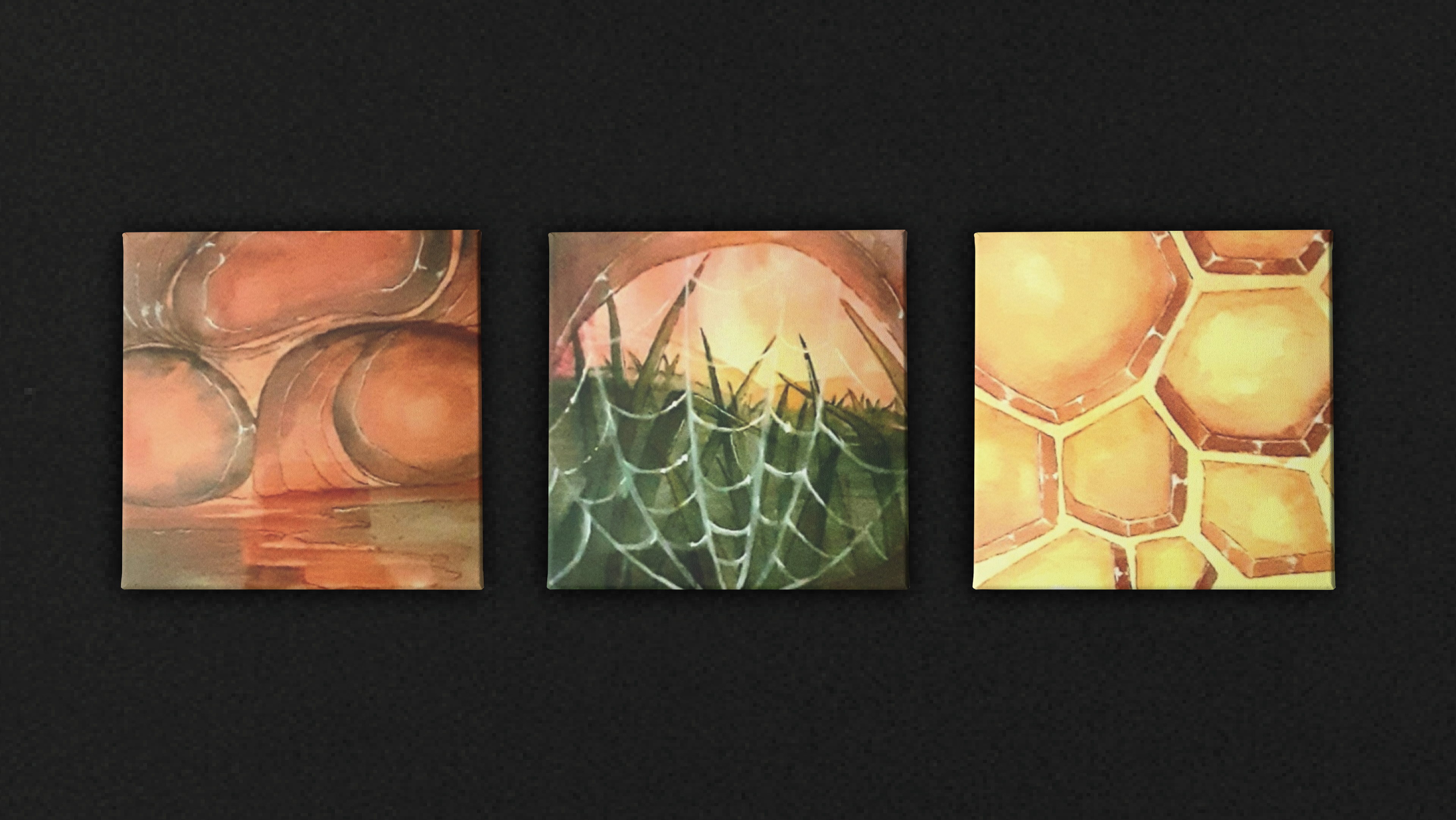
A Different Perspective ✦ 2022
This project was an exercise in semiotics, where each decision in its creation were purposeful in conveying a certain idea and feeling. For this project, I chose to represent the point of view of three different bugs (ant, spider, and bee respectively), in an abstract but easily understood way. I chose to work with watercolor as it has light and delicate properties, much like insects, and the color palette is consistent but unique to each piece, so they can be understood as a set or on their own. Additionally, the paintings themselves are small, measuring around only 4 or 5 inches each, inviting the viewer to observe them closely and put themselves in the perspective of each bug.
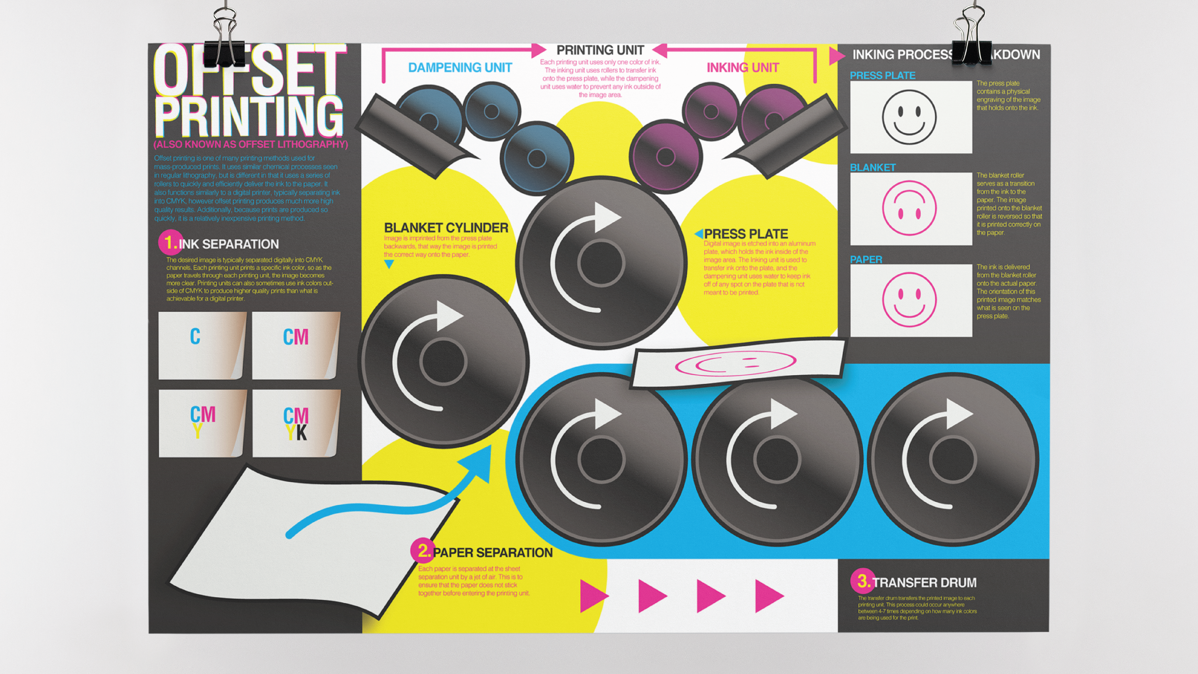
Offset Printing ✦ 2023
This project was an exercise in creating a large-scale infographic and understanding hierarchy. I represented the offset printing unit in an abstract side view, and also provided margins on each side to organize information. Challenges for this project were understanding scale in relation to the computer screen I was working from versus how the information would appear scaled up as a poster. It was also a challenge to work with as much information as I had and still maintain a readable hierarchy.
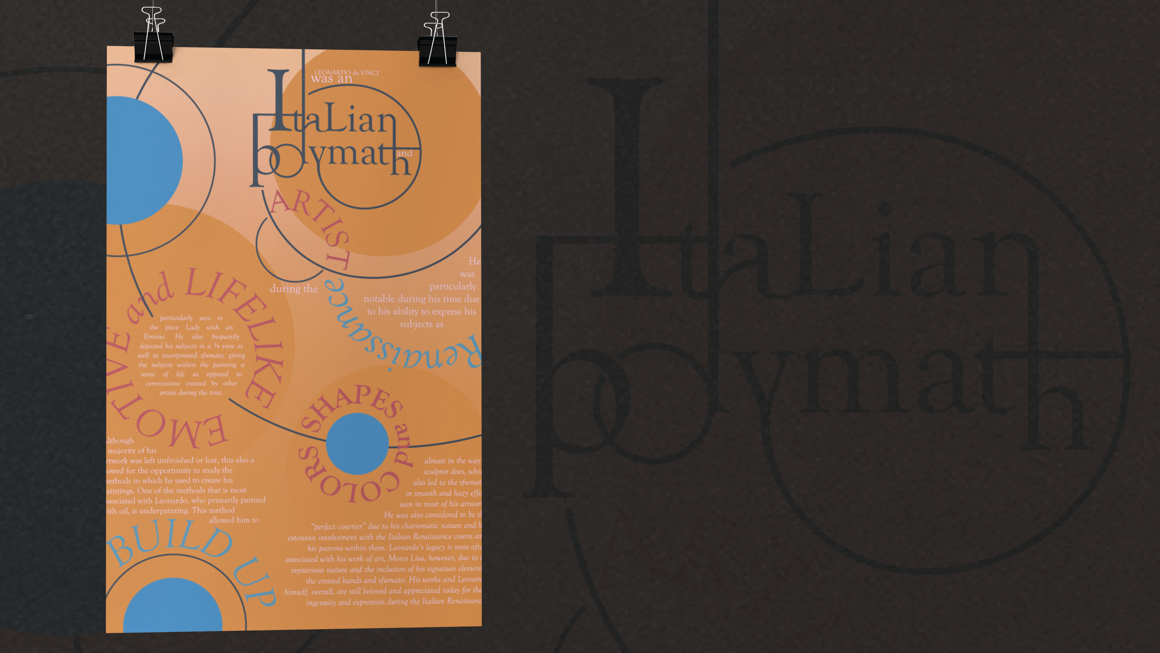
Da Vinci ✦ 2022
This project was an exercise in experimenting with typography in an interesting way, while still maintaining readability and flow. The main challenge presented was being unable to incorporate any other imagery besides type, shapes, and lines, forcing me to be creative with how the type tells a story. This poster goes into detail about the life of Leonardo da Vinci, and the composition is loosely based on the golden ratio spiral, which is associated with his work.
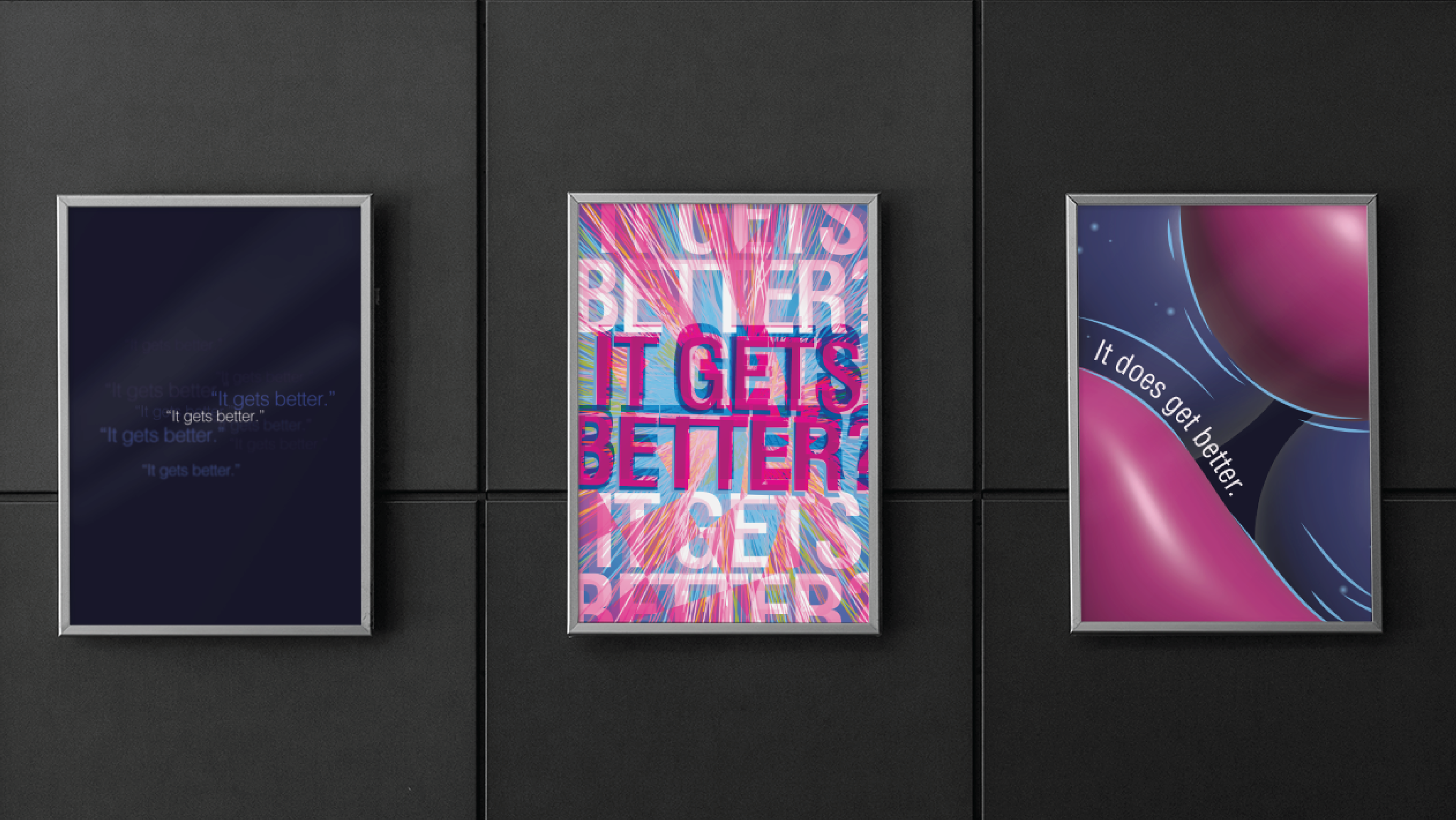
Grief ✦ 2023
This project was an exercise in creating something that expresses a certain theme in a series of three. I chose to represent three prominent phases of grief in poster form; the first one represents experiencing life after a traumatic event before grief sets in, the second one represents the exact moment grief hits the hardest, and the third one represents the "aftermath" of grief (though there is no true ending to grief, it represents the concept of living with it- while it may still feel suffocating, it gets easier to breathe and live with it). This project was also inspired by my own feelings of grief after losing a family member during my first year of college, and visually represents how I was feeling at each stage of processing this grief.
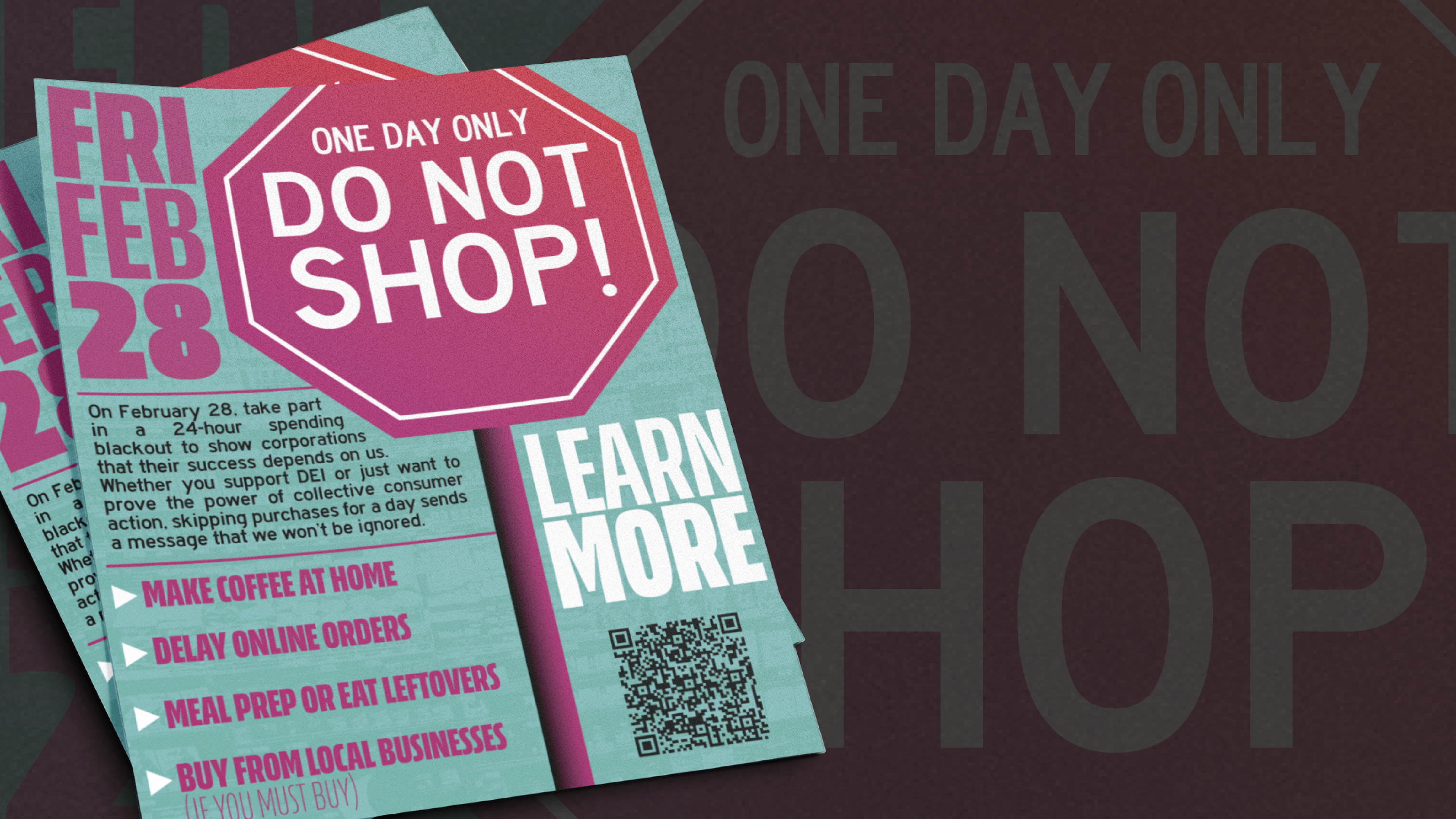
One Day Only - Do Not Shop ✦ 2025
This project was inspired by the Economic Blackout that took place on February 28, 2025. These were a series of flyers I designed and distributed around BGSU's campus, urging students to avoid shopping on this day only. The challenge I faced was designing a flyer that would catch students' attention and deliver as much information as quickly as possible.